Researching & developing the Logo & branding for my Mermaid Game, has developed from a male & mermaid forming a heart to something far more simple, after advice from experienced graphic designers.
Here follows parts of that journey...
I have looked at the brand image, which is something I do love to create, & have collated some inspirational images & words.
The image I wish to portray, targeting mainly the female market, is one of sexy yet strong, beauty & handsome - feminine & masculine etc:
With a logo created by the letter 'M' formed by a male & female form, creating a heart.
Music video's played part of my inspiration
My sketches & ideas:
A selection of my photographs, used for inspiration:
Various images taken by other people that I have collated, & saved, that have inspired the formation of my logo/branding; whether colour, shape, tone, imagery, subject etc. Sadly, a lot of these images I have discovered are via Facebook or Pinterest, & sadly do not show the photographer's details to allow me to credit them. Unless otherwise shown, the images have been sourced from Pinterest.
& in a total contrast to the above 'strong & metal' logo's, this font has a soft line, with some curves, yet with depth & strength of straight lines too, & I also like the unevenness of the lettering outlines, & layout. Gives a traditional feel, which is not fully what I am looking for in the MANMADe Mermaid logo, however there is some of this logo that appeals, & inspires me to soften & 'sexy-up' in a female form, on the logo lettering.
I don't know what this font is, but the hand drawn feel & soft flows yet strength of curve & tall 't's' is very apt to the feel of what I wish to portray with the Mermaid font.
via Facebook Peace of the Beach
I saw this on Facebook but the image was too small, & found this on a Yahoo image search
The colouring & texture has a warm yet strong feel, tall & uneven lettering is appealing, but is still too masculine due to the rock/stone-like chiselled effect.
I loved the busy - yet unfussy, heavy-on-fine fabric embellishment creating a raised texture, yet still softly-ornate & natural with a metallic hint.
Textures: via FB The Lane
The feminine & elegance of the sheer silk tulle, with the touch of glittering-metal for strength & subtle sparkle being in a pewter/dirty-silver. Similar feel of what I am trying to evoke in the logo.
PHOTOSHOP LOGO STAGES (initial idea)
Screen Shot of image analysis, omission & selection
Editing the background, & then manipulate the shape to see if I think it will suit.
If so, I will do more sketching & create a cleaner image.
Cleaning up the edges - not spending too much time making it exact, as this is only drafting
I selected, smoothed & deleted the background before I grew the edges, & then deleted again.
A thin outline appeared, & so I will look at whether this 'accident' is worth keeping!
Editing character images in Photoshop, & having trouble with the tools working properly; slow, intermittent & won't detach. Simply trying to clean up the base of the foot is proving ineffective & time-consuming, non productive, & thus incorporating (still editing) the logo is one idea that has come to mind: work in progress (WIP)
With further development, & advice, I have deemed this logo image unworkable for the actual 'name-logo'; the shape will be lost at a reduced size, it is too detailed & not
Printed
I am very lucky to know some lovely people who own a carp farm & cafe! After some rearranging over the last few weeks, I met up & had a gorgeous coffee today, & a trip out on a tiny Landrover-type-vehicle around their 3 lakes, & had the opportunity to take some photo's of the fish for my logo. It was a nit dull & wet, & I still have a lot to learn about my new camera, & also about photography, but got some images of some very active carp & a tail for my logo!
No flash!
Too much Flash!
Active baby Carp!
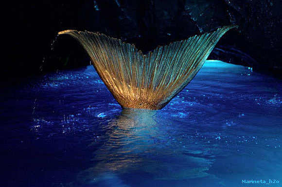
Trying to create the mermaid tail:
I have been editing the colours, vibrancy, saturation, etc in Photoshop
A little too vibrant but I am liking what has happened to the tail.
I put an overlay on this layer & the colour of the tail is pretty perfect!
Working on the cropped tail, & smoothing the edges & shading in places.
With the design changing to a simpler logo, the mermaid's tail was not needed for this.
NAME
I have written a few mindmaps for the name, & have even gone off-track by totally changing the name by adding descriptive words & ie 'legs & tails', & came up with other names, but the Mermaid & Man seems to create the impression more, & although not subtle, should grab the audience quicker; I am thinking commercially to help market the game to the right target audience.
My market research has included searches for adult mermaid games, to be aware & have an understanding of what is already available on the market, including names, branding, styles, age, consoles etc. This should help in analysing & deciding where to position the game.
I have a love of fonts, & the design, & how they create an image & portray a brand. I have looked at a lot of fonts for my logo, copy & branding etc, but until I have the exact name & more of an idea will keep collating those that have the style/feel I think suit this game. Then will display them on copies of the name, & develop....my Adobe Creative Cloud subscription is soon to offer an app that will enable me to sync fonts from Typekit, & so am hoping it will be soon to help me do this with more creativity.
In my research I found this website, Typewolf.com that displays fonts & websites with good design; "for design inspiration & font identification". It was recommended by Shillington College on my Facebook; I seriously looked at attending this college to do their graphics course, & thus value their recommendations.
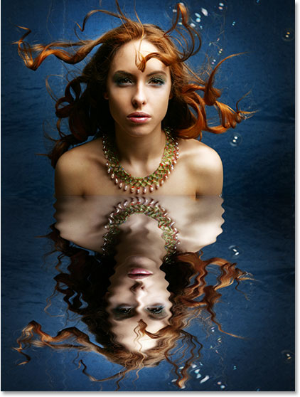
I came across a wesbite via LinkedIn, on Photoshop Tutorial : "How to make a splashed milk Typography on | I M A G E . L A P. Although I am not looking to create a splash of milk in a font, I can transfer some of the steps for splashing water & other. The English is not perfect, but is still easy to follow, & I will add some images of how & what I create here on my Blog. I perused some of their other tutorials but concluded that I can/have already located more suitable, easier step-by-step, more advanced & technically more comprehensive, tutorials elsewhere, including the Adobe company website. This website is also very suited to what I am looking for: Photoshopessentials.com, having various tutorials & lessons that I can access online or download as .printable PDF's, including advice on photo format's, which I am improving my knowledge on. A couple that I have already looked at are: Photoshop Water Reflection Effect, which is apt to my mermaid game, & Textured Text Effect In Photoshop, the latter images not being the style I am looking to create, but I can follow the process adding my own creativity to.
An idea to add the silhouette of a lighthouse developed when I was messing about with the name & logo, as this may form a pivotal location/role within the game. The lighthouse is a masculine & strong image, & is linked to the ocean & it appeared in one of my doodles. However, initially I am looking for images to help me create a silhouette only, to form part of the logo; the game will have 'lighthouses' that the player has to find, & use as a tool to attract their catch by decorating & filling with 'gadgets', ie boys-toys rooms, as their 'catch' will be housed here! They can add items by collecting/finding/winning/buying items.
I have some images of lighthouses but as these are taken with my mobile phone, & mainly distant shots & thus not that sharp.
My image taken with a Nokia mobile phone; settings for sepia
My own image taken with a Nokia mobile camera; it appeared like a comet from outer space had landed on the shore, the lighthouse in the background, although far off in the distant horizon, offered a sense of scale.
My own image taken with a Nokia mobile phone. The lone wandering man on the deserted beach shore, dwarfed by the strength of the proud standing-tall lighthouse, all marries under a dreary blowing sky, set in 'sepia'.
A hanging Jean Guichard (Even whilst visiting family, I take my studies with me......& camera!)
I haven't captured any dramatic images of waves crashing on lighthouses & illustrating the power of the ocean & strength of the lighthouse, as yet.
A favourite of mine, taken with a Nokia mobile phone, & un-edited as yet.
This may not be a real lighthouse, but gives the outline shape with some detail too.
For images for inspiration, & also to view first-hand, I need to take some trips to view some lighthouses to take photographs with my camera. I can also use for textures, but not sure if I will capture an image this cold:
Thomas Zakowski
I am not sure if this dramatic image has had much editing, but reading his story, he is a 'carer', he mentioned that he had not managed to get out to shoot much, & so had spent time updating his editing skills; one of the images shows this lighthouse in red & is on show here.
My sketching
My sketch - a tad crude I think, not as strong or as pretty as I want
Logo silhouette: this would be reversed & attached to side of the letter 'M'
My sketch in negative; I feel my sketches can look more dramatic when I take a photo with a negative setting, & the pen marks highlighted on black creates a totally different feel to the image.
My sketch as I sat eating my dinner with no point of reference
Although I set my phone to take the image in 'negative' it gave me 2 styles of image:
My sketch of New Brighton Lighthouse
My sketch of New Brighton Lighthouse
Inquisitive taking images with my mobile at a different angle; it creates a very different shape than the original
LOGO
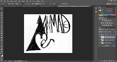
Sketching, doodling, & messing about with ideas for the game logo; this is all development, yet from my own experience, sometimes what initially seems wrong, or what you think, at first, will just not work, is actually the seedling of the answer!
Original idea; male/female forms to create the 'M' & heart. After advice from the HUB, I decided to amend this idea.
I still like this design, as it forms a strong yet open/bare/vulnerable image. However, the result is too fussy, & created problems when reducing the size, & so I moved to develop other ideas.
The characters remain but the idea for the logo has changed; no....it has developed:
A simple start to re-do/ further develop my ideas for the logo...put pen to paper!
Developed it...maintaining the feel of what it is you want to create & imbue in people for the game
The MANMADe needs to be strong & bold, yet with a little masculine curve ;) & the Mermaid softer yet sexy
The strength & boldness of the lighthouse silhouette on the MANMADe 'M', & the curving mermaid tail & rounder/heart-shape 'M' is paramount to illustrate these characters.
The strength of the MANMADe lettering is illustrated far more here, & the graphical-ness (if that is such a word??) is more apparent. The heart-shap developing from the Mermaid lettering (unfinished, I know) gives a subtle impression; something I remembered from the selection of logo's Dave showed me in the Hub at Glyndwr.
Trying to create a heart 'M'
Clean lined, but not quite the right shape - too soft.
Trying to create a heart 'M'
A little too bulbous, although the feel of Art Nouveau/waves is more apparent
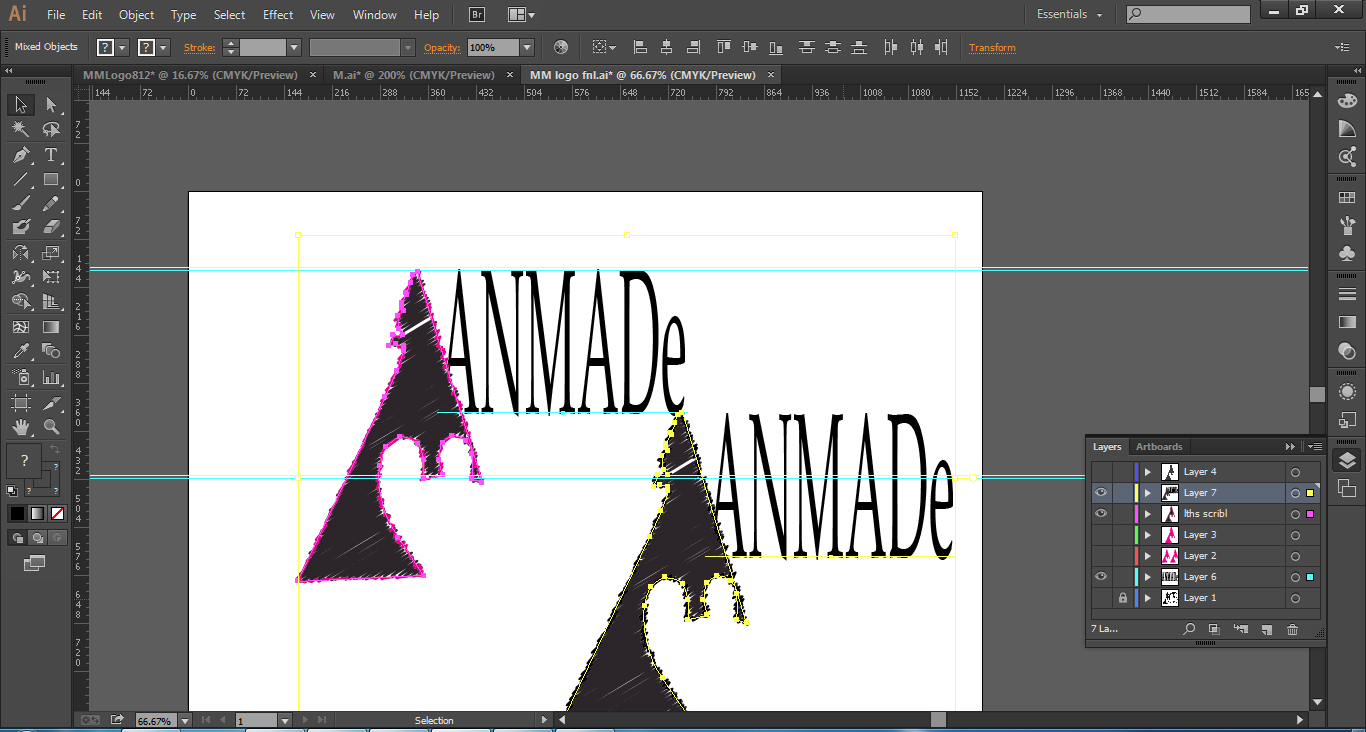
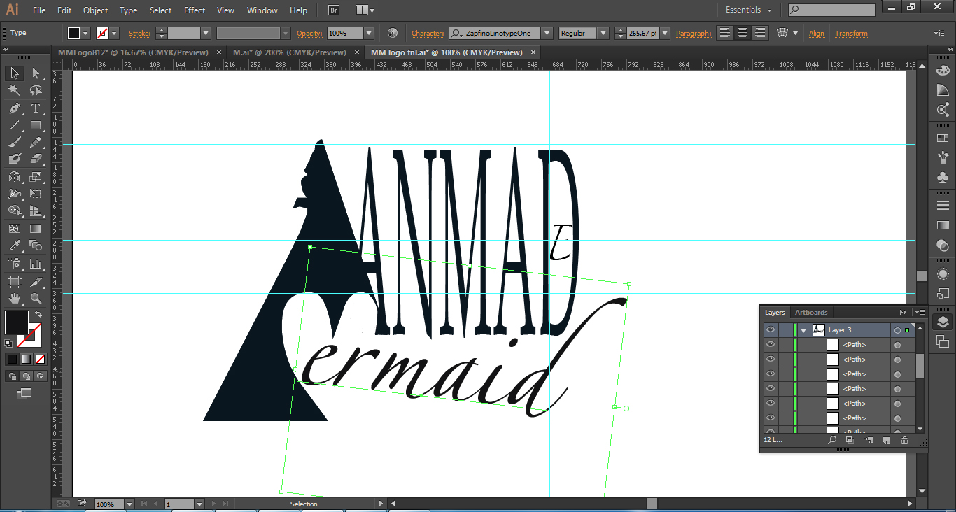
Creating Logo in Photoshop & Illustrator
Using the 'Pen' Tool to trace the shape
Adding a 'Scribble' effect
Adding an outline to the Lighthouse: I do not like the scribble effect outline as I think it loss the 'strong' feel.
Using the 'Erase' tool to take off part of the letter 'A'; it didn't work, as the part I erased kept coming back!
I thought having all the logo 1 dark colour lost the fun element, originally my colours were grey & pink, & so tried this, & then rounded the corners.
The MANMADe Mermaid Game Logo; I would still like to develop this.
After advice I decided to make it simpler, but I think some intricacy is missing, & the colours are not the darkened-jeweled I had hoped for. A heart needs added. This still needs work......
The MANMADe Mermaid Game Logo; I would still like to develop this.
After advice I decided to make it simpler, but I think some intricacy is missing, & even with adding pink, the colours are not the darkened-jeweled I had hoped for., & a heart is missing This still needs work......


 I
I 


No comments:
Post a Comment